Grocery
Type that works on a phone in the produce aisle
Labels, receipts, and recipe cards — why readable type still matters when you’re shopping from a phone.

A grocery site is a shelf, not a magazine. You are holding a phone in one hand and a banana in the other. If the type is pretty but the price is hard to read, the type has failed. That is the problem with typefaces on the web: too many of them are chosen for a homepage hero, then asked to survive a 160-pixel product card.
We learned this the expensive way. Early Grovewell mockups used a display serif on product names because it “felt premium.” In a grid of forty SKUs it felt like a wine list printed on a receipt. People scrolled past items they would have bought, because the name and the unit ran together. Premium that you cannot parse is just noise.
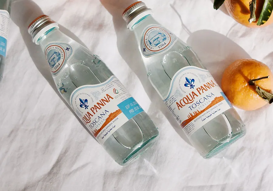
Shelf labels, not fashion
In a physical aisle the label is high contrast, short, and close to the price. The brand mark is small. The weight and the price are large. Online, the same job belongs to the product name, the unit, and the sale badge. A compact sans for navigation. A slightly larger weight for names. Numerals that do not collapse at 13 pixels. Never a script font on a unit price.
What a shelf label actually has to do
- Identify the thing in under a second — name, then brand.
- Show the size so a 500g tub is not confused with a 1kg tub.
- Put the live price next to any compare-at price, not three lines away.
- Survive a greasy thumb, a 5.4-inch screen, and late-evening brightness.
Good grocery type is invisible in the way a clean shelf is invisible — you only notice when it is wrong.
Contrast is a food-safety issue
Light grey on white looks calm in Figma and illegal on a phone in daylight. Allergen lines, unit prices, and “contains nuts” cannot sit at 3:1 contrast because someone thought muted type was sophisticated. We treat body copy like a use-by date: if you have to squint, it is wrong.
Dark mode is not an excuse to invert the palette and call it done. Navy backgrounds need brighter text, not the same #71778e we use in light mode. Sale red has to stay sale red — a washed pink is how a discount disappears.
What we actually set
One family. Two weights. Tabular lining figures for money. That is the whole system. Campaigns do not get a new font. Seasonal fruit does not get a script. If marketing wants a moment, they get a photograph, not a typeface.
- Body copy stays 15–16px with 1.6–1.75 line-height so recipe notes breathe.
- Product names are 15px semibold — large enough to scan, small enough for a four-column grid.
- Prices use tabular numbers so $4.99 and $14.99 align in a lattice.
- Sale red is reserved for money — never for a paragraph of “lorem”.
- Navigation is 13px uppercase tracking, the same job as an aisle hanging sign.
- Dark mode keeps contrast, not a grey-on-grey “premium” wash.
Receipts, recipes, and other small paper
A receipt that uses a display serif looks expensive and scans badly. A recipe that hides the oven temperature in a light weight is how you burn the tray. We treat those surfaces like packaging: one family, two weights, and enough space that a thumb can find the next line.
Recipe cards
Ingredients are a list, not a paragraph. Times and temperatures are bold. Yield sits next to the title so you do not scale a cake for eight when you meant two. If a step has a number, it is an ordered list — not a sentence that starts with “Then.”
Digital receipts
Line items, quantities, and totals must share a figure style. Mixed oldstyle and lining numbers make $8.00 and 8 pcs look like different languages. We keep lining tabular figures everywhere money appears, including the email you get after checkout.
Type that survives the cart
The cart, the search overlay, and the checkout line are where type either earns trust or leaks it. Search results need a name, a price, and a thumbnail — not a novel. Checkout fields should look like the rest of the store, not a bank form from 2009. If a customer can read the total from across the kitchen table, the typeface did its job.
- Search: 8 hits, each with a 40px thumb, a truncated name, and a price.
- Cart drawer: name, quantity stepper, line price. No descriptions.
- Checkout: labels above fields, 16px input text so iOS does not zoom.
- Success: the order number in the same tabular figures as the total.
That is why Grovewell does not rotate fonts for seasonal campaigns. The fruit changes. The type does not. Clarity is the brand. If a typeface cannot sit on a yogurt lid, a search row, and a shipping label without showing off, it does not belong in this shop.